Rachel Yeo Rong Qing / 0368901
Interactive Design / Bachelor of Design (HONS) in Creative Media
Exercise
CONTENT
LECTURES
1. Pre-recorded Lectures
Week 1 - Usability : Designing product for user satisfaction
Additional link :
https://www.youtube.com/watch?v=yY96hTb8WgI&authuser=0
Week 2 - The Anatomy of a webpage : 14 basics elements
⤷ Header:
- Header is the upper (top) part of the webpage and it is an element of strategic importance. Header is a area that reader see at the first on the website. Header also provide the core navigation around the website.
- Meaningful layout elements include in header :
~ Basic elements of brand identity, usually logo
~ Call-to-action button
~ Links to basic categories of website content
~ Links to the social networks
~ Basic contact information (tel.no, e-mail, etc.)
~ Switcher of the languages in case of the multilingual interface
~ Search field
~ Subscription field or button
~ Link to interaction with the product such as trial version, downloading from the AppStore, etc.
- Headers should not be overload with information. Too much of objects will attract user's attention, and user may not concentrate on the vital ones.
~ Hamburger menu : Hiding the set of links to different pages or sections behind the called so as it consists of horizontal lines looking like a typical bread-meat-bread hamburger.
~ Sticky header : Header that doesn’t hide away but sticks to the top part of the page when users are scrolling the page down. This way core navigation area is available at any point of interaction, which can be helpful in terms of content-heavy pages with long scrolling.
~ two-layer navigation: A sort of double set of navigation sites in the header to separate two different routes of navigation that are both important for web usability.
⤷ CTA Button:
- CTA Button stand for call-to-action button, is an element of a
user interface aimed at encouraging a user to take a certain action.
This action shows a conversation for a particular page or screen, such
as, buy, contact, subscribe, and etc. It has to catch attention and
stimulate users to do the required action.
- If CTA buttons are not clearly defined and do not attract attention,
visitors are likely to scan the content quickly and leave it untouched.
- CTA Button stand for call-to-action button, is an element of a user interface aimed at encouraging a user to take a certain action. This action shows a conversation for a particular page or screen, such as, buy, contact, subscribe, and etc. It has to catch attention and stimulate users to do the required action.
- If CTA buttons are not clearly defined and do not attract attention, visitors are likely to scan the content quickly and leave it untouched.
⤷Hero Section:
- Hero section is the above-the-fold (pre-scroll area of the web page containing the element that presents the strong visual hook: a hero image, slider, catchy piece of typography, video, or anything else attracting visitors' attention and transfers a needed message to them.
- The main idea is that the visual hook in the hero section instantly grabs attention and allows for setting the quick visual, emotional, and informative connection with the users, engaging them to scroll or push the buttons to learn more.
⤷ Footer:
- Footer is the lower (bottom) part of the web page which usually marks its end. The footer provides the additional field for useful links and data users may be interesting in finding.
- Footer can include:
~ Brand identity signs, usually the name and logo of the company or product
~ Links to user support sections, for example, FAQ page, About page, Privacy Policy, Terms and Conditions, Support Team, etc.
~ Credits to website creators
~ Contact forms and information
~ Links to company or product accounts in social networks
~ Testimonials and badges
~ Certification signs
~ Subscription field or button.
⤷ Slider:
- Slider is an interactive element that applies a technique of a slideshow or carousel to present different products, offer, etc. It is especially popular as a part of e-commerce and business websites to present a sort of gallery of products or services.
- Benefits of slider :
~ saving space on the page
~ user engagement
~ attractive visual hook
- Pitfalls of slider :
~ page speed decreasing due to slider functionality, this way influencing SEO
~ display of several equal options together, which may hurt usability and get distracting as people do not observe priorities, and that makes it harder to focus
~ possible problems of sliders in the mobile adaptation of the website
~ as well as banners, sliders can be perceived as ads and skipped
⤷ Search:
- Function that enables visitor to browse the content inside the website and shows it according to the search query.
- Save user's time and effort, amplifies usability and desirability of the digital product, helps retain users and increase conversion rates.
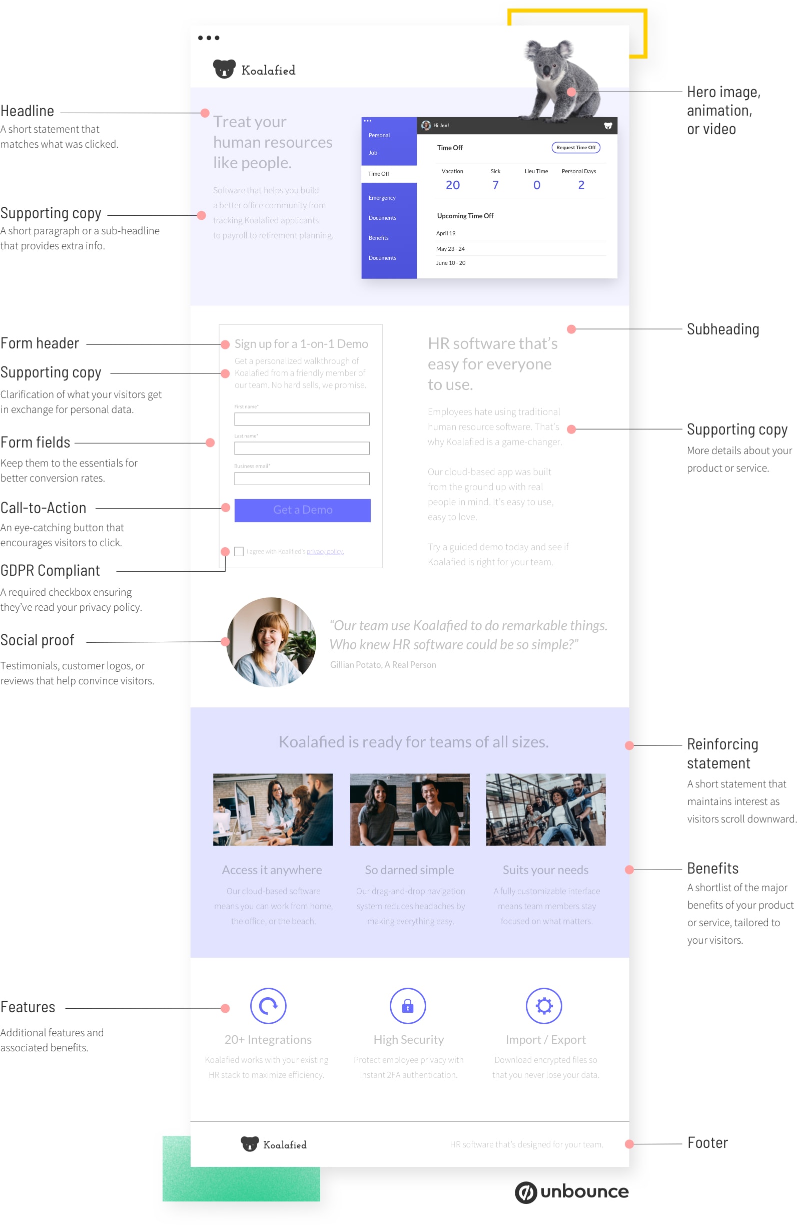
Week 3 - Usability : Designing product for user satisfaction
Additional link :
https://unbounce.com/photos/1.8_AnatomyofLandingPage.jpg?authuser=0
Week 4 - The Web
Week 5 - Html & CSS
- Week 1 : Mr. Shamsul give us a short brief about our modules and the task that we need to done before week 2.
- Week 2 : Mr. Shamsul ask us to make a prototype design based on the topic he given. The topic for our group was redesign the school e-learning system.
- Week 3 : Mr. Shamsul ask us to do two web replication based on the website given.
- Week 4 : Mr. Shamsul teach us how to type HTML code step by step by using notepad to create a simple website. After that, Mr. Shamsul ask us upload our website on Netlify.
- Week 5 : Mr. Shamsul briefing about our Project1, and teach us more about HTML coding.
INSTRUCTIONS
Task 1 : Exercise 1 - Web Analysis (Week 1)
- Consider the purpose and goals of the website, and evaluate whether they are effectively communicated to the user.
- Evaluate the visual design and layout of the website, including its use of color, typography, and imagery.
- Consider the functionality and usability of the website, including its navigation, forms, and interactive elements.
- Evaluate the quality and relevance of the website's content, including its accuracy, clarity, and organization.
- Consider the website's performance, including its load times, responsiveness, and compatibility with different devices and browsers.
Based on the three website link that given from Mr. Shamsul, I have choose the CSS Winner to find the website to analysis and write the brief report.
Website 1
1. Purpose and Goals

The purpose of this website is a studio that offering design, branding, marketing and content creation services to clients. The goals of the website is showcasing the agency work and capabilities, providing information about their services and encouraging potential clients to contact them for business opportunities.
2. Design and Layout


The website has use a clean, modern design with a focus on visual content and minimal text. As shown as picture above, the layout is straightforward with clear sections that separate content, guide the user's navigation and only using black and white colors and minimal text. This has let viewers can directly focus on the main point and understand the information easily.
Besides of that, the website also got a simple navigation bar at the top of the page and it allows user to easily access different sections of the site.
3. Functionality and Usability


The picture above has shown the pages after I click on the contact and work. The website has includes interactive elements such as clickable sections and buttons to guide users to specific pages. It has prove tat the website is easy to navigate and the contact forms and CTAs are also accessible, it making user easy to get in touch with the studio.


The picture above has shown the portfolio of this studio and the transition after we point to one of the works. This has make viewers can clearly appreciate the works they done before.
4. Quality and Relevance of Content


The content of the website is visually appealing with high-quality images that showcasing the studio work. It also relevant to the target audience, providing examples of their work in various industries and highlighting their creative capabilities. They also have a reviews sections to let clients can trust them more.
5. Performance
Website 2
1. Purpose and Goals

The purpose of this website is a platform that offer pet care products and services, specifically providing a solution for keeping pets safe and comfortable during owner travel or boarding. It aims to provide information on products and services to keep pets safe and happy during trip.
2. Design and Layout


The website design is simple and using a consistent color scheme which is light color to makes the websites conveys a soft feeling to audiences. The image in this websites all aims to showcase pet care products and services. There is a navigation bar at the top that leads to various sections of the websites. The navigations has state on the top of center and it is clear and easy but the navigation bar will coincide with other image sometimes, this will lead to a decrease in the user experience of using the website.
3. Functionality and Usability


The transition of the website was interested such as Fig 1.14 and Fig 1.15, when we try to scroll the page the information notes will jump up one by one. In this way, the users can be more easy to understand the step to booking their services. The usability of this website are quite strong due to the clear navigation, straightforward layout and the simple process of booking sections.
4. Quality and Relevance of Content


The content of this website are in a good quality due to it clear descriptions and professional images of the products and the services offered. It also relevant to pet owners who wants to explore alternative options to traditional pet boarding, especially whose interested inn keeping their pets with them during trips.
However, some of the typography might need to be improve a little bit such as the explanation inn Fig 1.18, the text are too small and don't have any paragraph. This has let the explanations looks like squizz to each others and decrease the readability of viewers.
5. Performance
Task 1 : Exercise 2 - Prototyping (Week 2)
This exercise has been constructed in class, Mr. Shamsul ask us to design a prototype based on the topic he given. The topic for our group was redesign the school e-learning system.
User need :
Student wants an easy-to-use platform for accessing course materials. submitting assignments, and communication with classmates and instructor.
Usability principles to consider :
- Consistency
- Simplicity
- Visibility
- Feedback
Process picture :


Task 1 : Exercise 3 - Web Replication (Week 3)
In this task, Mr. Shamsul has ask us to replicate 2 existing main pages of the websites given in the link below to gain a better understanding of their structure.
Instruction :
- Follow the dimensions of existing website from the width and height.
- Focus on the layout. type style, and color style.
- You can use ang image from stock image or free stock free, it does not have to be an exact image from the website, you can replace it with a similar image.
- Can download the fonts from Google Fonts.
Website 1
Links above has shows the website that I choose to replicate. Before I start to replicate the website in AI, I screenshots the website first an set the original website picture as template.

Next, I start to replicate the text and the context of this website. The picture below has add on a blue rectangle so that the white color text can be seen.

After the context is settle, I proceed to the background picture. Searching the similar picture is really a bit tough because I always cant find the picture that I am satisfied with it. How to make the gradual change from color to picture also a challenge for me but luckily I solve it at the end.

Last, I use pen tools to create some of the content image but some of them are just picture.

And yet, the replication of this website has been done. Below are the screenshots that shows the comparison between the original website (left) and the replication (right)

Website 2
https://www.morganstanley.com/?authuser=0
Same as the previous replication, first I screenshot the website and set it as template in AI.

Next, I replicate the text and the context.

And last but not least, replicate the image.

Below are the comparison between the original website (left) and my replication (right)

Final Outcome
Task 1 : Exercise 4 - HTML (Week 4-6)
Week 4
Mr. Shamsul teach us how to create the simple website step by step by using notepad. Below are the picture that shows the coding in notepad.

This picture has shown the preview of the website that I create.

- Document Type Declaration :
<!DOCTYPE HTML>
<html>
- Name website :
<head>
<title>NAME<title>
</head>
- Embed Image :
<img src="image/NAME FORMAT" alt="IMAGE FOLDER"
Width="XXX" height="YYY" title/>
- Embed Link Into a Word :
<a href="LINK"
target="_blank">WORD</a>
- Headings:
<h1></h1>
<h2></h2>
<h3></h3>
<h4></h4>
<h5></h5>
<h6></h6>
- Paragraph :
<p></p>
- Bold :
<b></b>
-Line Break :
<hr>
- Paragraph Space>
<br>
- Bullets element :
<ul>
<li>BULLET</li>
Week 5
In this week, we have learn a lot of coding notes in class (The word in Italics means editable) :
Mr. Shamsul continue the teaching of the coding. In this week, Mr. Shamsul teach us how to create a timetable by using coding in Adobe Dreamweaver.

Below are the timetable that I create.

At the end of the class, Mr. Shamsul ask us to explore how to create the contact form ourselves and done it before next week class.
Based on the result that I search in google, Below are the code that I type and the contact form that I create.


Coding Notes learned from this week (The word in Italics means editable) :
Mr. Shamsul ask us to continue the coding for last week and teach us the CSS.

Final Outcome
Link for viewing the website: https://rachel-html.netlify.app/
In this exercise, we have been asked to create a recipe cards by using HTML and CSS that teaching by Mr. Shamsul. We need to design a basic webpage that shows a recipe's ingredients and instructions.
Requirements:
- Create an Html file name "index.html"
- Create a section that displays the following information:
- recipe title
- necessary image
- list of ingredients
- step-by-step cooking instructions
- Create an external CSS file name "style.css"
- Apply CSS rules to style the recipe cards
- Use selectors such as element selectors (e.g., body, h1, ul), class selectors (e.g., .recipe-title, .ingredient-list), and ID selectors (e.g., #instructions) to style different parts of the card.
Link for viewing the website: https://rachel-recipe-cards.netlify.app/
Week 7
I have choose the following recipe to design the webpage because this recipe looks easy to prepare and I was interesting on it.
First, I create the index.html as following the instructions and I start to code the HTML by using DreamWeaver.

Next I add the CSS to the code.

After I make sure all is done, I separate the CSS to the external sheet as following the instruction that given by Mr. Shamsul.

Then, I upload the file to Netlify to publish this website.
Final Outcome
Link for viewing the website: https://rachel-recipe-cards.netlify.app/
FEEDBACK
Week 2 :
General Feedback : Overall prototype looks good, it looks almost complete already.
Week 3 :
General Feedback : Open the guideline and ruler can helps you on replicating the website and it will be easy for you to do the alignment.
Week 4 :
General Feedback : Make sure the name and the type of the image file is correct so that the image can be open in the website.
Week 5 :
General Feedback : Make sure there is no error shows in the Adobe Dreamweaver when typing the HTML.
Week 6 :
General Feedback : -
Week 7 :
General Feedback : -
REFLECTIONS
Through these exercise that I done, I have gain more knowledge about HTML and CSS. I found that the coding is quite fun to explore how depth is it. The exercise 2 which is the replicating website exercise has give a challenge to me because it was hard to found the font that are similar to the website that we chosen, I have spend a lot of time on it. In other perspective, the last exercise has really makes me enjoy on it especially when I successfully create what I want by using code follow to the instruction that I search on google. These exercise has teach me a lot of things and makes me more interesting on the HTML and also CSS.
Comments
Post a Comment